1. Four Major Donor-Retention Sins
by Jonathan Howard
You know that the key to net gains and year-to-year growth of your direct mail fundraising lies with your donor retention rate. Helping first time donors become loyal friends can generate as much as an 80 percent return on investment.
That’s a pretty great business model. But few nonprofits get it right. Here are some key reasons why American philanthropy’s donor retention stinks.
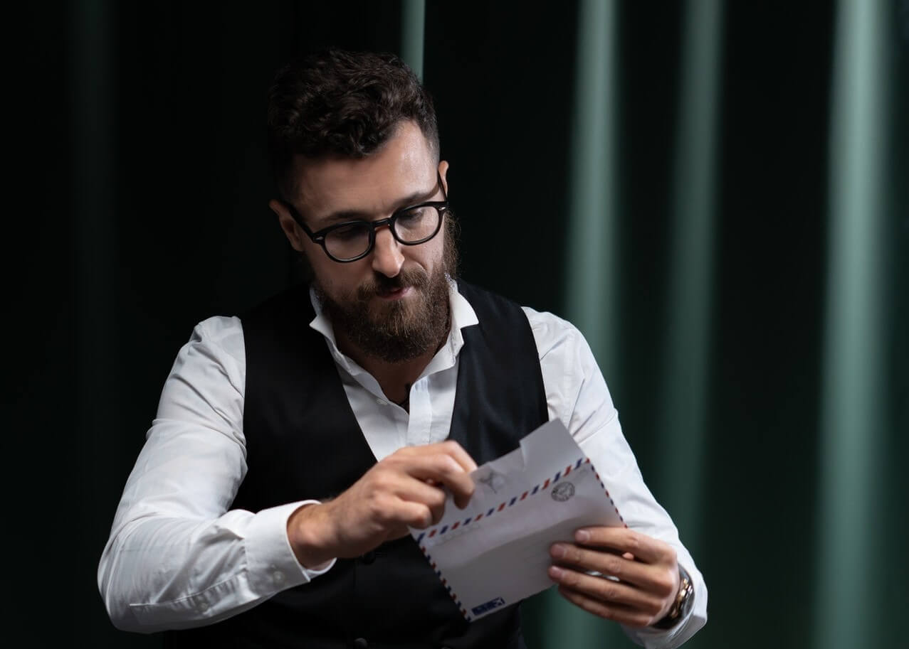
Stingy thank-yous. I just sent you money to change kids lives or save the world. Now I want swift assurance that my money is making that important difference. Instead, I get a form letter back, focused on the tax-deductibility of my gift from some mid-level employee in the development office. Often these aren’t even personally signed.
Awkward introductions. I’ve just taken one step into your world. Are you going let me know you’re happy to see me, bring me up to speed on your work and dreams and introduce me to other people I’d find interesting? That’s the job of the friendly welcome package that donors … the “package” they should get within two weeks of their gift. But generally don’t.
News I can’t use. My donation is not a license to bore me with “news” about your meetings and big shots, or just as bad, to give me no news at all. I want to know how you help me be more like the person I want to be: compassionate, effective, wise. Donor communications should be all about the donor, not the organization. The word “you” should appear in every item.
Ineffective asks. Some nonprofits fail at mail because they don’t ask for repeat contributions soon enough or often enough. Others fail because they treat donors like automatic teller machines. Both groups fail because they don’t offer donors good reasons to give again. It’s not “mail” that donors dislike – it’s the lack of sincere respect and regard for them that turns donors off.
The answer isn’t turning off the mail. The answer is using mail to build an honest relationship of head and heart with your recent donors.
=-=-=-=-=-=-=-=-=-=-=-=-=-=
Jon Howard is Vice President of Cause & Effect, Inc.
He has helped nonprofits develop successful direct response strategies and
effective donor communications for more than 25 years.
Contact Jonathan Howard or
visit the Cause & Effect website
=-=-=-=-=-=-=-=-=-=-=-=-=-=
2. Make your Grant Proposals More Visually Appealing
by Jayme Sokolow
For better or worse, I have looked at thousands of proposals in my lifetime, both inside and outside the government. Many of them have been visually unappealing. They repel rather than attract readers and are difficult to read. They are uninviting and hence a chore to analyze and evaluate.
This is odd, as the people who put proposals together are often highly intelligent. Perhaps because they are so focused on the content, they ignore the obvious need to make their proposals readable … pleasing to the eye.
We know a great deal about what makes proposals visually appealing. There are ways to avoid giant blocks of plain text without a great deal of effort.
Bryant Freeland has some simple, practical suggestions that we can all follow to visually help separate our proposals from the others:
• Every page should have a graphic, table, or color to get the reader’s attention. A good page template with your organization’s logo and headers and footers can help make each page more inviting. Even text-oriented readers need visual cues. Good graphics, tables, and color increase interest and understanding, especially when they are well-integrated with the text.
• Create heading styles that easily show sections and subsections. Chunks of text should be broken down into manageable sizes for readers.
• Use page breaks and binder tabs to show where sections begin and end.
• Use different font sizes, bold text, and color to highlight important points.
• Use plenty of indented, bulleted and numbered lists to display information and emphasize major points.
These are simple tips, but they will make a big difference in how your proposal appeals to evaluators.
Do not, however, value style over substance. Good grant proposals, regardless of how they look, must demonstrate an understanding of the identified problem, emphasize features and benefits, and present a superior solution to the problem identified in the grant guidelines.
If you can do this and make your proposal visually appealing, you are likely to have a much more competitive application.
Next Week, Watch for a Fascinating piece about
How Fundraising Managers
Can Work Effectively with Millennials
=-=-=-=-=-=-=-=-=-=-=-=-=-=
Dr. Jayme Sokolow, founder and president of The Development Source, Inc.,
helps nonprofit organizations develop
successful proposals to government agencies
Contact Jayme Sokolow..
=-=-=-=-=-=-=-=-=-=-=-=-=-=
Look for Jayme’s ebook on
Finding & Getting Federal Government Grants.
It’s part of
The Fundraising Series of ebooks
They’re easy to read, to the point, and inexpensive ($1.99 – $4.99)
=-=-=-=-=-=-=-=-=-=-=-=-=-=
If you would like to comment/expand on the either-or-both of the above pieces, or would just like to offer your thoughts on the subjects of this posting, we encourage you to “Leave a Reply.”
 Sections of this topic


