Sections of this topic

With a whopping 3.8 billion smartphone users around the world, with the largest platform of communication and business, the internet remains at the top. If you are looking to expand your reach, take your market over the internet. But you are not the genius nor the inventor of such ideas, there are people ahead of you. So how are you planning to take your turn over the internet?

Creating a website that runs over the internet is not the only solution for you. People who own smartphones tend to spend 6.9 hours of their average time on their phones. So there are pretty high chances of your viewers ending up on your website through their phone. Are you prepared? Are you having a mobile-friendly website to hold your audience right there?
All you need is an updated version of your website that is compatible enough to work well with mobile browsers. With higher performance efficiency, responsiveness, and battery consumption, you are supposed to incorporate your ideas into smaller screens with compact info but with impactful expression. But let just know-how is that supposed to happen? What is the plan you will be working on? Just to ease your workout, we have created a guide, which will make your website work on mobile seamlessly. A fifteen-minute procedure to update your website for mobile applications.
What does your viewer want?
But before jumping onto the guide, you should know what your viewers are expecting from your website. How to attract your viewers and give them the right reasons to stay over your website. 3 out of 5 users will abandon the website if it does not load in 2 to 3 seconds. That’s why the response of your website has to be very quick, moreover, you need to make sure your website does not look very much crowded, it has to be attractive and help make your viewers spend more time looking at it. The website content has to be compact and crisp to create a larger impact over such small screens. And you have to make sure the website can represent your ideas perfectly through your mobile version. Authenticity should remain.
Now give me the drum rolls, it is time to take you through the 15 minutes guide to make sure your website is user-friendly and works flawlessly over the mobile version.
The view of your website
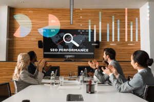
Most of the time, no scratch that, all the time people go with the appearance of the website. Users spend an average of 5.94 seconds just looking at your website, and that’s the icebreaker for your website. You have to make sure the view of your website is influential enough on smaller screens as it is on larger screens. What your customers are viewing over the website decides future references and conversations over the website. You have to make clever moves and bring the best version forward with engaging content and visuals.
Crisp menu bars
You don’t have to involve a hectic navigation bar in your mobile versions. The navigation bars are the most useful feature of a website when it comes to the desktop version, as it helps the viewer to make his/her way through a projected course. But in mobile view, the navigation bar gets congested and very small to even look at, and the buttons also become very small to even click upon. It irritates the viewers and they give up on your website.
What you can do is try making a small and efficient drop-down menu or you can design a hamburger menu and direct all the navigation bar links to that menu only. It will take less space and will make your website look more clean and efficient.
Make sure your menu is not very large or full of options, try to make it short and crisp, add only important information pages links, and try skipping irrelevant content. It has to look clean and engaging.
What will you put on the menu?
Make sure to prioritize your content from a viewer’s point of view, you need to list the elements that are secondary which you can put up into the menu bar. The primary information has to be on the front page only. Like a user account, details can be put up as a piece of secondary information you can place in the menu tab. You have to channelize the major and important content over the front page, and everything else linked through your menu bar.
Good quality, high-resolution images are good to go
Poor quality images are a big no. You cannot use pictures of poor quality. And you have to even make sure about the standard resolution for viewing the picture through the mobile version of the website. Sometimes the desktop resolution may vary from the mobile resolution for viewing an image. Make sure the image does not tear up or pixels disassemble when you zoom into the image.
Say no to adobe flash player
Earlier when networks started speeding up and developers introduced videos and higher pixel images into their websites, Adobe flash player became very common at that time. Pops used to blink over your screen with requests to download, install and start using adobe flash players to view the videos. But over time people realized that security is one major aspect while visiting the websites. Adobe flash player was never considered as a secure option, as the installations sometimes lead to the introduction of viruses into the systems. Moreover, it was not supported over the apple products.
So the developers declined the usage of Adobe flash player on their websites, they rather introduced the idea of embedding YouTube video links. It is more secure and works directly over the cloud.
View modes
As you have now created an ultimate content presentation of your website, you should now look into how it will be represented to the viewer. The following points are to be kept in mind while going through the view of your website:
- There should be vertical scrolls over the website, meaning the scrolls should go from up to down in portrait mode and landscape mode as well. The left to right scrolls is hard to manage and make your website look dull.
- Options to view some web pages on landscape mode as well, there are things which are much more convincing when in landscape mode, hence don’t ask your viewer to change the mode rather suggest the better mode yourself.
- Prefer a single-column layout for mobile versions of the website. The multiple column versions work very well over the desktop but on smaller screens, it gets really hard to maintain clarity and engage the viewers into each of the columns. It is better if you follow the single-column layout rule.
Drop the idea of pop-ups
The aim of pop-ups is to attract all attention towards the info you would like your viewer to know about, it intends to direct the viewer directly to the page linked to the pop-ups. But over time pop-ups have lost their actual ability, now pop-ups just cause trouble to the viewers with irrelevant ads. Developers have to keep in mind that such pop-ups cause disturbance to the viewer’s experience and then they avoid your website, hence it is better to avoid the use of pop-ups on your website.
Use bigger clickable elements
The smaller screens require clear clickable elements, the desktop version has a lot of space to experiment around with. But on mobile versions, you have limited space to work upon with. Hence you need to extract space to adjust some of the clickable elements. Rather than approaching multiple clickable elements you can go with just one button and launch a new page where other elements could be incorporated.
Elements in your reach
The important elements should have higher and most easy reachability among all the elements present on your website. Use highlights and maybe popping out colors to mention the important elements of your website. The elements should be aligned to the center of the website, elements that are pressed into the corners of the screen do not gain much attention.
One thing you should also focus upon is the availability of a homepage element into each of your linked web pages so that the viewer can easily come back to the homepage.
Don’t push too many downloads and installations
Make sure you do not push forward the policies of downloading and installing permanent files into your viewer’s device. Ensure all the information is available to the cloud with each feature working properly without demanding certain plugins or downloads. Such situations create an instant dislike towards your application. The customer chose cloud service to save time and memory space spent over the installations, and would not appreciate the same effort demanded from your website. Hence it is considered a smart move to not ask for downloads.
Clicks should not lead to multiple links
The clickable elements of your website should not lead the viewer to unexpected links to random websites and ads. Avoid such incidents and reduce the involvement of paid ads over your website. Viewers feel the connections and not secure of your website and avoid coming onto your website. It is a safer option to not lead your elements onto random multiple links.
Bringing the best tool
Well, you can work over all these elements in only 15 minutes using the LT Browser. The browser covers all the above-detailed features and enhances all the stated necessities. LT browser proves to be one of the best tools to practice efficient mobile testing. Users have multiple options to work overview grids, hamburger menu creations, and options to always change the resolution of the images using this browser. You can even test your website for many situations and prompts. There are several tests present on the LT browser, of which two important ones include-
- Cross-browser testing,
- And, responsive test
All other small and big tests are included in these two only. The tests are highly accurate and done with precise mapping by automated processes.
There are multiple reasons to stick with the LT browser for all your projects. You can take your mobile version of the website to absolute heights using this browser functionality. There are multiple parameters you can play with, but we have mentioned the basic requirements that you should look for in your website. There is always a scope for better ideas and advancements into your website but try to remain rooted with the authentic idea of your website.